Color & Paint
What Color Goes With Lavender? 13 Pairings & Palettes
Sage, cream, charcoal, navy, blush and brass: the colors that go with lavender, with hex codes, moods, copyable palettes and room-by-room ideas.
Free design tool
Choose a base color and a color harmony, and this room color palette generator builds a balanced 60-30-10 scheme with hex codes, plus a trim white, previewed on a room illustration. Start from scratch or tap a designer preset such as Greige & Brass or Navy & Cognac.
Results are planning guidelines based on standard interior design rules of thumb. Always measure twice and check product dimensions before you buy.
The generator always returns three main colors in a 60-30-10 split, because that proportion is the simplest reliable way to make a room feel balanced. The 60 percent color covers walls and the largest surfaces, so it is usually the quietest shade. The 30 percent color goes on furniture, rugs, curtains, and bedding, adding contrast without competing with the walls. The 10 percent accent shows up in pillows, art, vases, and small decor, giving the eye somewhere to land.
The tool also suggests a trim white that suits your base color. A warm palette gets a creamy white with a touch of yellow; a cool palette gets a cleaner, crisper white. The wrong white is one of the most common reasons a palette looks off, so do not skip it.
| Share | Where it goes | What it does |
|---|---|---|
| 60% | Walls, large rug, big upholstered pieces | Sets the overall mood and light level |
| 30% | Sofa or bed, curtains, chairs, bedding | Adds depth and contrast |
| 10% | Pillows, throws, art, lamps, vases | Creates focal points and personality |
| Trim | Baseboards, doors, window frames, ceiling | Frames the scheme cleanly |
A harmony is a rule for choosing colors based on their positions on the color wheel. Each one produces a different mood.
If you are not sure where to start, the presets are combinations that consistently look polished in apartments:
Two colors with the same name can look completely different on your wall because of undertone, the subtle hue beneath the main shade. Greige can lean green, pink, or violet; white can lean yellow, blue, or gray. Hold samples against your floor, countertops, and largest fabrics, and choose colors whose undertones agree.
LRV (Light Reflectance Value) runs from 0 for black to 100 for pure white and tells you how much light a paint reflects. As a rule of thumb, colors above about 60 keep a room bright, the 30s to 50s read as true midtones, and anything below about 20 feels dramatic. Dim, north-facing rooms usually benefit from a higher-LRV 60 percent color, while a sunny room can carry something deeper. For softer options with good light reflectance, see our roundup of pastel colors for home.
Designer tip: Screen colors are a starting point only. Buy peel-and-stick samples or paint a poster board at least 2 by 2 feet (60 by 60 cm), and move it around the room. Check it in morning light, late afternoon, and at night under your own bulbs before you buy a gallon.
Light direction changes everything. North-facing rooms get cool, even light that pushes colors toward gray and blue, so warm undertones help. South-facing rooms get warm, strong light that intensifies yellows and can wash out pale colors. East-facing rooms are bright in the morning and cool later; west-facing rooms are the reverse. Your bulbs matter too: warm 2700K bulbs make cream and blush glow but can muddy cool grays.
Test the 30 and 10 percent colors as fabric swatches or decor, not just paint. If you rent and cannot paint, apply the palette entirely through textiles, art, and furniture, using the existing wall color as your 60 percent. Our list of renter friendly upgrades and guide to warm pastel bedroom paint colors can help you put the palette to work, and the paint calculator tells you how many gallons to buy once you commit.
The 60-30-10 rule divides a room's color into three proportions. About 60 percent goes to the dominant color on walls and large surfaces, 30 percent to a secondary color on furniture, rugs, and textiles, and 10 percent to an accent on pillows, art, and accessories. The split creates balance, so the room feels cohesive without looking flat or chaotic.
Start with something you cannot or will not change, such as your floors, a large sofa, or a favorite rug, and pull your base color from it. Pick a harmony that matches the mood you want: monochromatic or analogous for calm, complementary for energy. Then test the wall color with large samples in your actual light before committing.
LRV stands for Light Reflectance Value, a scale from 0 (absolute black) to 100 (pure white) that measures how much light a color reflects. Most manufacturers list it on the swatch or website. Higher-LRV colors bounce more light and help small or dim rooms feel brighter, while low-LRV colors absorb light and feel moody and enclosing.
An undertone is the subtle hue sitting beneath a color's main shade. A beige might lean pink, yellow, or green; a gray might lean blue or warm toward taupe. Undertones show up most when colors sit side by side, so compare samples against your floors, cabinets, and fabrics. Matching undertones keeps a palette harmonious even when the main colors differ.
Monochromatic, analogous, and warm neutral harmonies usually work best in small apartments because related colors blur the edges of the room and make it feel larger and calmer. Using the same light color on walls and trim also helps. Save complementary or triadic schemes for small doses, such as accent pillows or a single painted piece of furniture.
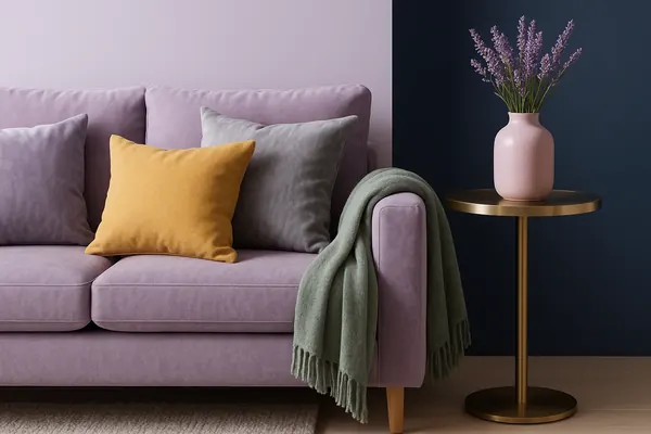
Sage, cream, charcoal, navy, blush and brass: the colors that go with lavender, with hex codes, moods, copyable palettes and room-by-room ideas.
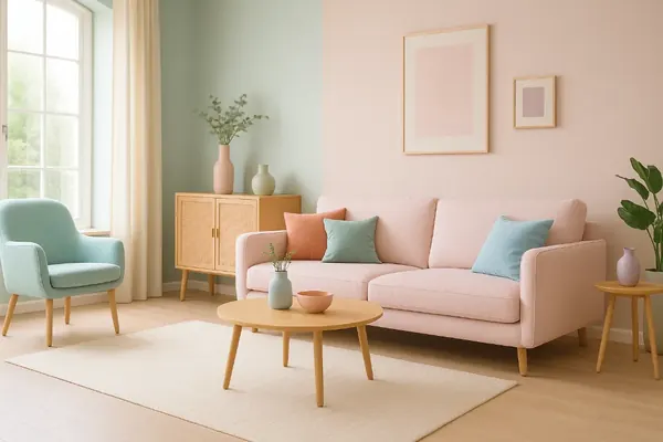
Muted pastels, smart pairings with hex codes and room-by-room ideas for using pastel colors at home so they look soft and sophisticated, never sugary.
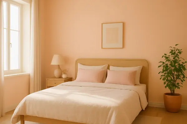
Peach, blush, buttermilk and warm lilac: 12 warm pastel bedroom colors with hex codes, LRV ranges, lighting advice and palettes that feel sophisticated.