What Color Goes With Lavender? 13 Pairings, Palettes and Room Ideas
Sage, cream, charcoal, navy, blush and brass: the colors that go with lavender, with hex codes, moods, copyable palettes and room-by-room ideas.
Key takeaways
- Lavender pairs best with sage, olive, cream, white, charcoal, blush, navy, plum and brass.
- Check your lavender's undertone first: blue-leaning suits silver and slate, pink-leaning suits brass and cream.
- Lavender and sage works because purple and yellow-green are near-complements softened by gray.
- Grayed lavender with an LRV of about 60 to 75 behaves like a neutral and is the safest choice for walls.
- Always add one deep anchor color so a lavender room does not look washed out.
The colors that go best with lavender are sage and olive green, warm creams and soft whites, charcoal and slate gray, blush and dusty pink, navy, and warm metallics like brass and gold. For contrast, its near-complement, a soft buttery yellow, makes lavender look brighter. What color goes with lavender in your home really depends on the mood you want: green and cream feel calm and natural, gray and white feel modern, pink feels romantic, and navy or plum feels rich and dramatic.
Lavender is a pale violet, a mix of red and blue lifted with white. Some lavenders lean blue and cool, others lean pink and warm, and many have a gray cast that makes them feel quieter. Knowing which kind you have is the key to choosing companions that look deliberate rather than accidental.
Below you will find a pairing table with hex codes and moods, palette formulas you can copy, room-by-room ideas including lavender living room ideas, and the common mistakes that make lavender look dated.
Is Your Lavender Warm or Cool?
Before choosing partner colors, identify your lavender's undertone. Hold your paint chip, fabric or cushion next to a pure blue object and then a pure pink one. Whichever it looks more related to tells you its lean.
- Cool, blue-leaning lavender (around #C9C6E8): reads like periwinkle or lilac-gray. It pairs best with silver, crisp white, slate, navy and eucalyptus-type greens.
- Warm, pink-leaning lavender (around #E3D0E6): reads like pale orchid. It pairs best with cream, blush, brass, terracotta and olive.
- Grayed lavender (around #CFC7D6): a muted, dusty version that behaves almost like a neutral. It is the most adaptable and the easiest choice for walls.
Designer tip: If you want lavender walls that feel grown-up, choose a grayed lavender with an LRV in the 60 to 75 range. Clean, saturated lavenders look sweet on four walls but work well in smaller doses like a cushion or a vase.
The Best Colors That Go With Lavender (With Hex Codes)
Use this table as a starting point. Hex codes are approximations for building a digital palette or comparing paint chips; real paint and fabric will vary.
| Pair lavender with | Approx. hex | Mood it creates | Works best in |
|---|---|---|---|
| Sage green | #A8B5A0 | Calm, garden-fresh, natural | Living rooms, bedrooms |
| Olive green | #6B6B3A | Earthy, grounded, sophisticated | Living rooms, dining nooks |
| Warm cream | #F3EBDD | Soft, airy, timeless | Any room |
| Crisp white | #F8F8F6 | Clean, fresh, Scandinavian | Bathrooms, kitchens |
| Charcoal gray | #3E3D40 | Modern, moody, tailored | Living rooms, home offices |
| Dove gray | #C9C7C3 | Quiet, serene, understated | Bedrooms, bathrooms |
| Blush pink | #EBC8C4 | Romantic, gentle, dreamy | Bedrooms, dressing areas |
| Navy | #1F2D4D | Classic, confident, elegant | Living rooms, bedrooms |
| Deep plum | #5B2E4F | Rich, dramatic, tonal | Accents, velvet upholstery |
| Butter yellow | #F2E2A0 | Cheerful, spring-like, high-contrast | Kitchens, breakfast nooks |
| Terracotta | #B5694A | Warm, Mediterranean, unexpected | Living rooms, balconies |
| Brass / gold | #B08D57 | Glamorous, warm, luxurious | Hardware, lighting, frames |
| Walnut brown | #5C4033 | Mid-century, cozy, grounded | Furniture, floors |
Want to see how any of these balance in a room? Enter your lavender as the base in our room color palette generator and try analogous, complementary or split-complementary harmonies.
Lavender and Sage: Why This Pairing Works So Well
Lavender and sage is the most popular combination for a reason: it mirrors the real lavender plant, with violet flowers above gray-green leaves. On the color wheel, purple and yellow-green are near-complements, so they make each other look richer, while sage's gray content keeps the contrast soft rather than jarring.
How to use it
- Sage walls, lavender accents: the easiest version. Add lavender cushions, a throw and a vase of dried lavender stems.
- Lavender walls, sage textiles: try sage linen curtains or a sage velvet armchair against grayed lavender walls.
- Add a neutral bridge: warm cream or natural oak stops the pair from feeling too themed.
Keep both colors at a similar softness. A pale lavender with a bright kelly green clashes; a pale lavender with a dusty sage harmonizes.
Lavender Color Palette Ideas to Copy
These palettes follow the 60-30-10 rule: roughly 60 percent dominant color (walls, large rug), 30 percent secondary (upholstery, curtains), and 10 percent accent (cushions, art, metals).
| Palette | 60% | 30% | 10% | Feel |
|---|---|---|---|---|
| English garden | Grayed lavender #CFC7D6 | Sage #A8B5A0 | Warm cream #F3EBDD | Fresh, relaxed |
| Modern gallery | Crisp white #F8F8F6 | Charcoal #3E3D40 | Cool lavender #C9C6E8 | Graphic, minimal |
| Quiet luxury | Warm cream #F3EBDD | Grayed lavender #CFC7D6 | Brass #B08D57 | Soft, refined |
| Evening drama | Navy #1F2D4D | Warm lavender #E3D0E6 | Brass #B08D57 | Bold, elegant |
| Tonal violet | Grayed lavender #CFC7D6 | Dusty mauve #A88BA0 | Deep plum #5B2E4F | Enveloping, moody |
| Spring kitchen | Crisp white #F8F8F6 | Cool lavender #C9C6E8 | Butter yellow #F2E2A0 | Bright, cheerful |
The quiet luxury version is the one we recommend most often for apartments: cream walls, lavender upholstery or curtains, and touches of brass. It suits the restrained approach described in our guide to quiet luxury interior design.
Lavender Living Room Ideas
Lavender works in a living room when it is treated as a sophisticated neutral rather than a statement candy color.
Lavender sofa or armchair
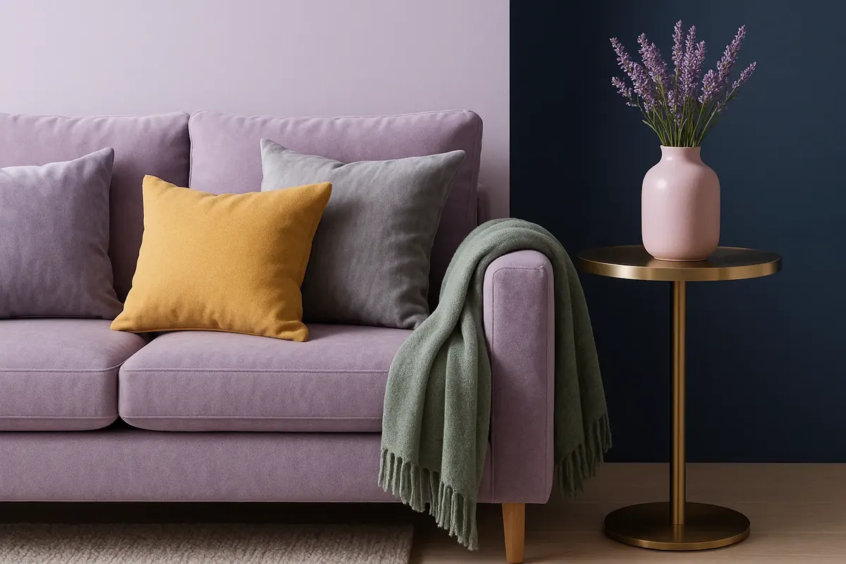
A velvet sofa in dusty lavender is a luxurious focal point. Ground it with a charcoal or oatmeal rug, walnut side tables and cream walls. Keep cushions tonal (mauve, plum, cream) or add one sage pillow for contrast. Our guide on how to style pillows on a couch explains sizes and combinations.
Lavender walls with dark anchors
If you paint the walls lavender, bring in weight: a charcoal sofa, black picture frames, a dark wood coffee table. Without darker elements, a lavender room can feel washed out.
Lavender as a supporting accent
Not ready to commit? Introduce lavender through a rug with violet tones, an abstract print, curtains or a ceramic lamp. Repeat it at least three times around the room so it looks intentional.
For layout and furniture ideas that go beyond color, see our apartment living room ideas.
Lavender in Bedrooms, Bathrooms and Kitchens
Bedrooms
Lavender is a natural bedroom color. Pair grayed lavender walls with white or cream linen bedding, a blush throw and brass lamps for a soft, romantic feel. For a moodier bedroom, try lavender bedding against navy or deep plum walls. If you prefer warmer tones overall, compare it with the shades in our guide to warm pastel bedroom paint colors.
Bathrooms
Cool lavender with white tile, chrome or polished nickel fixtures and gray marble looks clean and spa-like. Warm lavender with brass fixtures and terrazzo feels more boutique. In a small bathroom, lavender towels and a bath mat are an easy renter-friendly way to test the color.
Kitchens
Lavender cabinets are a confident choice, especially lower cabinets with white uppers or open shelves. Pair with butter yellow or warm wood for a cheerful look, or with white marble-look counters and brass pulls for elegance.
Renter note: You can bring lavender into a rental without paint. Try removable wallpaper in a lavender linen texture, slipcovers, curtains, a rug or peel-and-stick cabinet film. Always check your lease before painting walls or cabinets.
How Light Changes Lavender Paint
Lavender is one of the most light-sensitive colors you can put on a wall, which is why a chip that looks perfect in the store can turn gray, blue or pink at home. Before you pick partner colors for walls, check how your lavender behaves in your room.
| Room faces | What happens to lavender | What to choose |
|---|---|---|
| North | Cool light pushes it toward gray-blue | A pink-leaning lavender, paired with cream and brass |
| South | Warm light makes it look brighter and pinker | A grayed or blue-leaning lavender to stay calm |
| East | Glowing in the morning, cooler later | A balanced, grayed lavender |
| West | Flat in the morning, rosy at sunset | A cooler lavender with white trim |
Your bulbs matter too. Warm 2700K bulbs make lavender look softer and slightly pinker, while 4000K and above makes it read bluer and cooler. Paint two coats on a large sample board, at least 12 x 12 in. (30 x 30 cm), and look at it next to your sofa or bedding in the morning, afternoon and evening before you decide. Partner colors behave the same way: a sage that looks soft in daylight can look muddy under cool bulbs, so test them together.
How much lavender should you use?
If you love the color but worry about committing, think in terms of proportion. As a wall color, lavender covers roughly 60 percent of what you see and sets the whole mood. As a secondary color in curtains, a sofa or bedding, it is about 30 percent and feels deliberate but not overwhelming. As an accent at 10 percent, through cushions, art, a vase or a throw, it is easy to change with the seasons. Most first-time lavender users are happiest starting at 30 percent.
Lavender also works on balconies and patios. Lavender cushions on teak or charcoal furniture, surrounded by silvery-leaved plants and real lavender in terracotta pots, makes a small outdoor space feel like Provence.
Which Metals and Woods Go With Lavender?
Materials can pull lavender warm or cool, so match them to your undertone.
- Brass, gold and bronze: warm up any lavender and add a luxe touch. Best with pink-leaning or grayed lavender.
- Silver, chrome and polished nickel: sharpen blue-leaning lavender for a crisp, modern look.
- Light oak and ash: keep a lavender scheme fresh and Scandinavian.
- Walnut and dark-stained woods: add depth and a mid-century feel.
- White marble and terrazzo: pair well with lavender in bathrooms and kitchens.
What Colors Should You Avoid With Lavender?
Very few colors are truly off-limits, but a few combinations are harder to pull off:
- Bright primary red or orange: they overpower lavender's softness and can look chaotic.
- Too many other pastels at once: lavender plus mint plus baby blue plus pink reads like a nursery or a party. Limit pastels to two, plus neutrals.
- Clashing undertones: a cool, blue lavender next to a warm, yellow beige can make both look dingy. Keep undertones aligned or bridge them with a true neutral.
- Neon green: too harsh. Choose sage, olive or eucalyptus instead.
Lavender looks most expensive when it behaves like a neutral and something darker does the heavy lifting.
Putting Your Lavender Palette Together
- Identify whether your lavender leans blue, pink or gray.
- Choose your mood: calm (sage, cream), modern (charcoal, white), romantic (blush), or dramatic (navy, plum).
- Assign colors using 60-30-10, with lavender as either the main color or the accent.
- Add one deep anchor color so the room has weight.
- Match metals to the undertone: brass for warm, silver for cool.
- Test paint samples on the wall in daylight and lamplight before committing.
Lavender is far more versatile than its reputation suggests. Pick partners with a similar softness, ground the scheme with one darker tone, and it will look calm and polished in any room. For more soft color ideas across the home, see our guide to pastel colors for home.
Free interactive tool
Room Color Palette Generator: 60-30-10 palettes with hex codes
Frequently Asked Questions
What color goes best with lavender?
Sage green, warm cream and charcoal gray are the most reliable partners for lavender. Sage creates a calm, natural look, cream keeps things soft and airy, and charcoal adds modern contrast. For a luxurious finish, add brass or gold accents. Match the partner color's softness to your lavender so the combination feels harmonious rather than jarring.
Do lavender and gray go together?
Yes. Lavender and gray is a classic, sophisticated pairing. Dove gray creates a quiet, serene room, while charcoal adds drama and makes lavender look brighter. Cool, blue-leaning lavenders work especially well with gray, silver and white. If your lavender leans pink, choose a warm gray or greige so the undertones stay compatible.
Does lavender go with sage green?
Lavender and sage is one of the most popular color combinations because it echoes the lavender plant itself. Purple and yellow-green sit close to opposite on the color wheel, so they enhance each other, while sage's gray softens the contrast. Use sage walls with lavender accents, or the reverse, and bridge them with cream or natural wood.
What is the complementary color of lavender?
Lavender's complement on the color wheel is a soft yellow, so pale butter or lemon-cream tones create the strongest contrast and make lavender look more vivid. In interiors, a muted yellow-green like sage gives a gentler near-complementary contrast that many people find easier to live with in large areas.
Is lavender a good color for a living room?
Lavender works well in a living room when you choose a dusty or grayed version and balance it with darker anchors like charcoal, walnut or navy. A lavender velvet sofa against cream walls is an elegant focal point. If you are unsure, start with curtains, cushions or art and repeat the color at least three times around the room.

We research designer standards, measure real rooms and test every recommendation against apartment realities: tight footprints, lease rules and budgets. How we write our guides.