There’s a reason designers keep turning back to warm pastel bedroom paint colors. These shades strike a delicate balance between calm and comfort, turning an ordinary bedroom into a soothing retreat. Pastels are no longer reserved for nurseries or springtime palettes—they’ve evolved into versatile tones that work beautifully in sophisticated, modern interiors. If you’ve been searching for a way to make your bedroom both inviting and timeless, warm pastels are your ticket in.
Why Warm Pastels Matter in Bedroom Design
Color psychology is powerful. In the bedroom—the most personal and restorative space of the home—it’s even more impactful. Warm pastels work because they sit between softness and depth. They have the calming qualities of muted tones without tipping into cold or sterile. Imagine blush that feels cozy instead of sugary, or coral that glows softly instead of shouting for attention. That’s the magic of warm pastel bedroom paint colors.
The undertones are the difference-maker. Warmth comes from hints of peach, coral, yellow, terracotta, or beige. These tones reflect natural light differently, creating an atmosphere that feels restful in the morning sun and intimate under soft evening lamps. Cool pastels may freshen a space, but warm pastels invite you to linger.
The Benefits of Warm Pastel Bedroom Paint Colors
Warm pastels aren’t just visually pleasing—they’re functional too.
- Cozy Ambiance: They create a sense of comfort without overwhelming the senses.
- Versatility: They adapt to various design styles—boho, modern, farmhouse, even Scandinavian.
- Lighting-Friendly: They look good in both natural daylight and warm artificial lighting.
- Timeless Appeal: They’re soft enough to last through trends but warm enough to avoid feeling dated.
Your bedroom should feel like an exhale at the end of a long day. Warm pastels make that possible.
Popular Warm Pastel Shades for Bedrooms
When selecting warm pastel bedroom paint colors, it helps to start with tried-and-true shades. Here are some of the most popular options that designers (and homeowners) keep reaching for:
Peachy Blush
Romantic yet refined, peachy blush pairs well with cream linens and natural wood furniture. It’s perfect if you want a touch of femininity without going overboard.
Warm Coral
Coral is bold in its brighter form, but when softened into a warm pastel, it feels lively yet restful. Try it on an accent wall behind the bed for a subtle statement.
Buttercream Yellow
Cheerful without being loud, buttercream yellow brings sunshine indoors. It works especially well in smaller bedrooms that need a lift.
Dusty Rose
This muted pink with beige undertones is a favorite for creating sophistication. It feels more grown-up than bubblegum and pairs beautifully with brass fixtures.
Muted Terracotta
Earthy, grounding, and chic. Muted terracotta has enough depth to add interest while still reading as a pastel when softened.
Warm Mauve or Lavender
If you love purple but fear it may look cold, lean into mauves with warm undertones. They bring softness with just a whisper of color.
Pairing Warm Pastels with Other Colors
Warm pastel bedroom paint colors rarely exist in isolation. Pairing them thoughtfully can make or break the design.
- Neutrals for Balance: Cream, beige, or taupe anchor the palette and prevent overload.
- Dark Contrasts: Navy or charcoal create depth and keep the space from feeling too airy.
- Metallic Accents: Gold, copper, or brass enhance the warmth of pastels.
- Natural Textures: Wood, rattan, or linen add dimension and prevent flatness.
The key? Layer textures as much as colors. A peach wall with linen bedding, brass lamps, and a woven rug feels complete. The same peach wall with plain white sheets can fall flat.
Design Ideas for Using Warm Pastels
There’s more than one way to introduce warm pastel bedroom paint colors. Experiment with techniques and placements to see what resonates with your space.
Accent Walls
If you’re hesitant, start with one wall—typically behind the bed. A coral or dusty rose accent wall grounds the bed as the focal point.
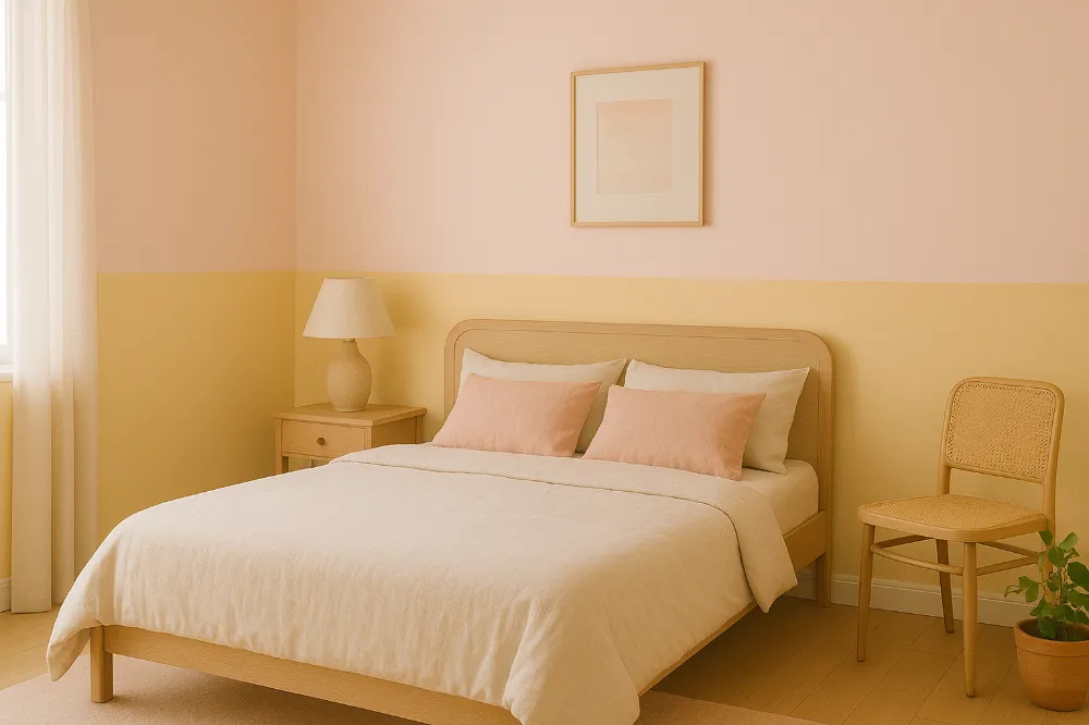
Two-Tone Walls
Divide the room horizontally with a chair rail. Try buttercream on the bottom and soft peach above for visual interest.
Painted Ceilings
Don’t forget the “fifth wall.” A blush or warm lavender ceiling adds depth without crowding the space.
Coordinated Decor
Paint the walls a muted terracotta, then carry the palette into bedding, curtains, and throw pillows. Consistency creates harmony.
How to Choose the Right Warm Pastel Shade
Paint swatches can be deceiving, so selection requires strategy.
- Test Lighting: Paint swatches on different walls and observe throughout the day. Morning and evening light change everything.
- Consider Room Size: Lighter shades expand small spaces. Deeper pastels add intimacy to larger ones.
- Check Undertones: If your flooring leans warm (like honey oak), stick with peachy or coral undertones. Cooler flooring pairs better with mauve or lavender.
- Match Personality: A serene dusty rose might suit a restful retreat, while buttercream yellow energizes morning risers.
Mistakes to Avoid
Warm pastel bedroom paint colors are forgiving, but a few pitfalls are worth noting:
- Mixing Too Many Shades: Stick to one or two main colors. More can feel disjointed.
- Ignoring Undertones: A blush with blue undertones will clash with warm wood. Always test first.
- Forgetting Texture: Pastels need texture (linen, wood, brass) to avoid looking flat.
- Skipping Samples: Paint looks different on walls than on cards. Always test before committing.
Styling Inspiration: Warm Pastels in Action
Here are a few design scenarios to spark your imagination:
- Boho-Inspired Bedroom: Blush walls, cream macrame decor, rattan headboard, layered rugs.
- Modern Minimalist: Dusty rose paired with light gray and matte black fixtures.
- Farmhouse Warmth: Buttercream walls, distressed wood nightstands, and vintage-style lamps.
- Luxe Elegance: Coral accents with velvet bedding, gold mirrors, and crystal lighting.
Each example uses warm pastel bedroom paint colors in a way that feels intentional and stylish, proving their versatility across different aesthetics.
Actionable Tips for a Flawless Finish
Let’s move from theory to practice.
- Always prep your walls with a neutral primer so the pastel’s true color shines.
- Use a matte or eggshell finish in bedrooms to create a softer, cozier look.
- Pair painted walls with at least one contrasting element (wood, metal, or textured fabric).
- Don’t ignore ceilings and trim—they can either highlight or clash with your chosen pastel.
- For renters, consider peel-and-stick pastel wallpaper in warm tones. It’s reversible but effective.
The Bottom Line
Warm pastel bedroom paint colors are more than a trend—they’re a timeless choice for comfort and style. They transform a space from generic to personal, all while maintaining an atmosphere of calm and warmth. Whether you lean toward blush, coral, buttercream, or terracotta, the right pastel will make your bedroom feel like the sanctuary it’s meant to be.
Start small if you’re nervous. Paint an accent wall or try a soft pastel ceiling. Once you see the glow these shades bring, you’ll wonder why you didn’t embrace them sooner. Your bedroom deserves it. And so do you.