Walk into a room bathed in soft, muted hues, and you’ll notice something immediately. The atmosphere shifts. The energy calms. Pastel colors for home design have that effect—they invite serenity while still carrying personality. They’re subtle without being bland, colorful without being loud. And if used with intention, they can transform a house into a haven.
Why Pastel Colors Work in Homes
Pastels are timeless. They’ve lived in nursery walls and retro kitchens, but today they’re finding a bigger role in modern interior design. Why? Because pastels strike the perfect balance. They bring vibrancy but without overwhelming the senses.
Think about the psychology of color for a second. Bright red energizes, navy blue anchors, and earthy brown grounds. Pastels? They soften. A pastel pink warms the edges of a room. Mint green feels like a breath of fresh air. Baby blue whispers calmness. Lavender invites a romantic, dreamy vibe. And soft yellow? It’s sunshine on a cloudy day.
That’s why homeowners are rediscovering pastels—not just as accents but as main players in their design palettes.
The Psychology of Pastel Spaces
Colors affect emotions more than most people realize. If you’ve ever felt restless in a bold red dining room or sleepy in a pale blue office, you’ve seen it firsthand. Pastel colors for home design work because they lower the visual volume. They give the eye a place to rest.
For example:
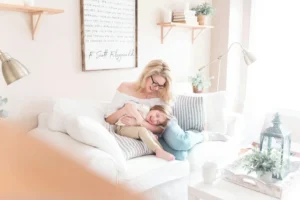
- Pastel Pink brings warmth, making it ideal for living spaces where connection matters.
- Mint Green has a natural freshness that feels perfect for kitchens or sunrooms.
- Lavender can turn an ordinary bedroom into a sanctuary.
- Baby Blue mimics the tranquility of the sky, instantly opening up small rooms.
- Soft Yellow creates cheer without blinding brightness.
If you want a space to feel calmer, lighter, and more welcoming, pastels are the tool.
Popular Pastel Shades and How to Use Them
Let’s break down how you can actually apply these hues at home.
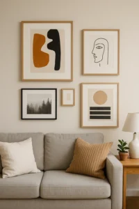
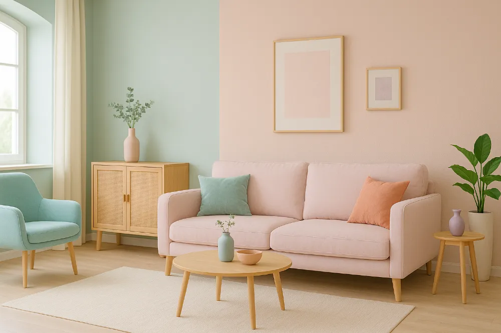
Pastel Pink
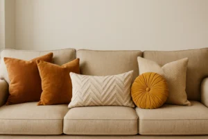
This shade has grown beyond its “nursery” stereotype. Use it for accent chairs, throw pillows, or even a statement wall in a living room. Pair it with deep charcoal gray for sophistication, or with brass fixtures for elegance.
Mint Green
Mint is like a cold glass of water—it refreshes instantly. Kitchen cabinets in mint green look timeless with butcher-block counters. A mint bathroom wall paired with white subway tiles feels both classic and new.
Baby Blue
A baby blue ceiling in a bedroom mimics open skies, expanding the space visually. In a home office, it reduces stress and helps maintain focus.
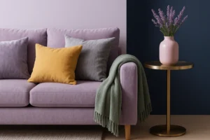
Lavender
Think bedroom textiles. Lavender bedding or drapery instantly elevates a room into something serene and slightly romantic. It also works beautifully in reading nooks or meditation corners.
Soft Yellow
Perfect for entryways or breakfast nooks. This color welcomes light and warmth, setting a cheerful tone for the day.
Where to Use Pastel Colors at Home
The beauty of pastels is their versatility. You don’t need to repaint every wall or buy new furniture. Small changes make a big difference.
- Living Room: Incorporate pastel throw blankets, rugs, or wall art.
- Bedroom: Use pastel bedding, lampshades, or a feature wall behind the headboard.
- Kitchen & Dining: Experiment with pastel cabinetry, dishes, or even barstools.
- Bathroom: Pastel towels, candles, and tiles can transform the vibe without a complete renovation.
- Home Office: A pastel-colored accent wall reduces stress and improves focus.
Start with accents, then build up if you like the vibe.
Pairing Pastels with Other Design Elements
Here’s where pastel colors for home really shine: when you combine them with complementary textures and tones.
- Neutrals: Pair pastels with white, beige, or gray to keep the look minimal and airy.
- Bold Tones: Use dark green or navy blue with pastels for striking contrast.
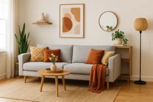
- Textures: Wood, linen, rattan, and marble bring pastels to life. Imagine mint green paired with natural oak—it’s a match made in design heaven.
- Metallics: Gold and brass elevate pastels, while chrome brings a modern edge.
Balance is the key. Too much pastel without grounding elements risks making a space feel washed out.
Pastel Trends in Home Design
If you’ve been watching design trends, you’ve noticed pastels sneaking into all sorts of styles.
- Scandinavian Minimalism: White walls with muted pastel accents for calm, functional spaces.
- Modern Farmhouse: Pairing sage greens and blush pinks with rustic woods.
- Coastal Calm: Sandy neutrals with pastel blues and soft aquas for breezy, beachy vibes.
- Pastel Maximalism: Layering multiple pastels together for a playful yet intentional aesthetic.
No matter your style, pastels can fit—they’re like the chameleons of interior design.
Actionable Tips for Decorating with Pastel Colors
Ready to bring pastels into your own space? Here’s how to do it effectively:
- Start Small – Try accessories first. A pastel throw pillow or vase lets you test the waters without commitment.
- Layer Textures – A pastel blanket feels warmer when layered over a linen sofa.
- Use Lighting Wisely – Natural light enhances pastel softness. Artificial warm lighting keeps them from feeling cold.
- Balance with Neutrals – Use pastels as highlights, not the entire palette.
- Anchor with Dark Tones – Pair soft hues with deeper colors to avoid a “childish” feel.
Inspiring Pastel Color Combinations
If you’re wondering how to mix and match, here are a few go-to combos:
- Pastel Pink + Gray: Soft yet sophisticated.
- Mint Green + Natural Wood: Fresh, organic, and timeless.
- Lavender + Gold: Elegant with a touch of luxury.
- Baby Blue + White: Clean and breezy.
- Soft Yellow + Sage: Warm and earthy.
These combinations keep pastels feeling grown-up and refined.
DIY and Budget-Friendly Pastel Ideas
Not ready for a full remodel? You can still weave pastels into your home without draining your wallet.
- Repaint old furniture in a pastel shade. A mint dresser or blush coffee table makes a statement.
- Create DIY pastel wall art using inexpensive canvases and acrylic paint.
- Swap out everyday items like lampshades, plant pots, or storage boxes with pastel versions.
- Even small swaps—like pastel kitchen towels or desk accessories—shift the mood of a space.
The Future of Pastel Design
Will pastel colors for home design stay trendy? Absolutely. But more importantly, they’re adaptable. As bold colors come and go, pastels stay useful because of their flexibility. They can be layered, muted, or brightened depending on what’s in fashion.
Think of pastels as the background singers of design—they may not always be center stage, but they make everything else sound better.
Conclusion
Pastel colors for home design aren’t just about aesthetics. They’re about creating spaces that feel calm, inviting, and personal. Whether you’re painting an accent wall, swapping textiles, or experimenting with furniture, pastels give you a palette that works across styles and budgets.
So don’t be afraid to try them. Start small. Add a pastel throw pillow or paint a side table. Watch how it changes not just your space, but your mood too. Sometimes the softest colors make the strongest impact.
FAQs
Mint green, pastel pink, baby blue, lavender, and soft yellow top the list.
Yes! Pastels open up tight spaces, making them feel larger and brighter.
Not at all. Pastels are trending in minimalism, farmhouse, and coastal designs.
Pair them with dark tones, natural textures, or metallic finishes.
Lavender and baby blue are especially soothing for rest and relaxation.